Visualize the data: How missing data biases data-driven decisions
This is the fourth post in a series about how missing data can bias data-driven decisions. Start at the beginning: What’s missing? Reduce bias by addressing data gaps in your analysis process.
Visualizing data is crucial to communicate the results of a data analysis process. Whether you use a chart, a table, a list of raw data, or a three-dimensional graph that you can interact with in virtual reality—your visualization choice can cause data to go missing. Any time you visualize the results of data analysis, you make intentional decisions about what to visualize and what not to visualize. How can you make sure that data that goes missing at this stage doesn’t bias data-driven decisions?
In this post, I’ll cover the following:
- How the usage of your data visualization can cause data to go missing
- How data goes missing in data visualizations
- Why accessibility matters for data visualizations
- How a lack of labels and scale can mislead and misinform
- What to do about missing data in data visualizations
How people use the Georgia Department of Public Health COVID-19 daily report #
When creating a data visualization, it’s important to consider how it will be used. For example, the state of Georgia provides a Department of Public Health Daily COVID-19 reporting page to help communicate the relative case rate for each county in the state.
In the midst of this global pandemic, I’m taking extra precautions before deciding to go hiking or climbing outside. Part of that risk calculation involves checking the relative case rate in my region — are cases going up, down, or staying the same?
If you wanted to check that case rate in Georgia in July, you might struggle to make an unbiased decision about your safety because of the format of a data visualization in that report.
As Andisheh Nouraee illustrates in a now-deleted Twitter thread, the Georgia Department of Public Health on the COVID-19 Daily Status Report provided a heat map in July that visualized the number of cases across counties in Georgia in such a way that it effectively hid a 49% increase in cases across 15 days.
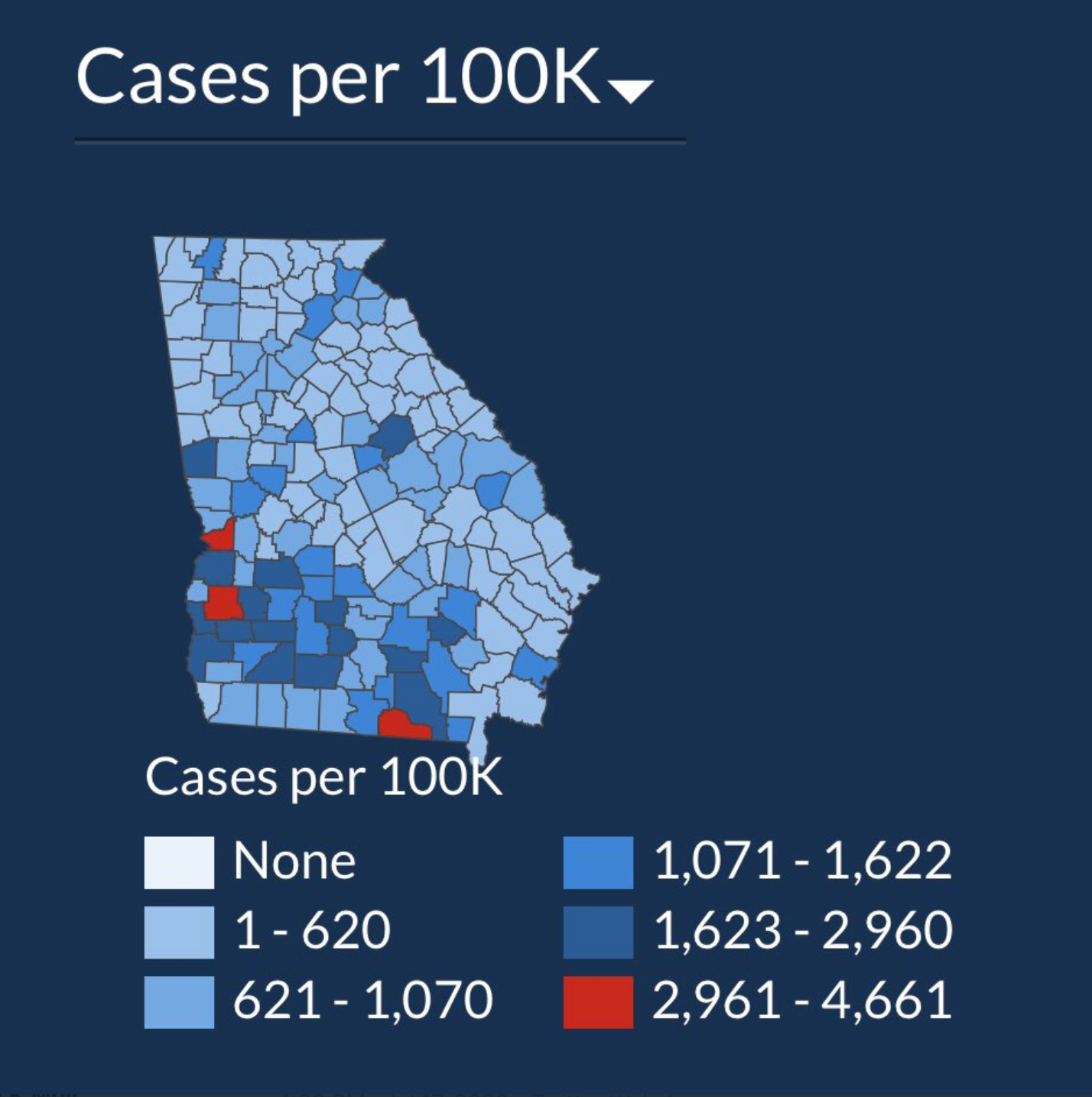
Image from July 2nd, shared by Andisheh Nouraee, my screenshot of that image
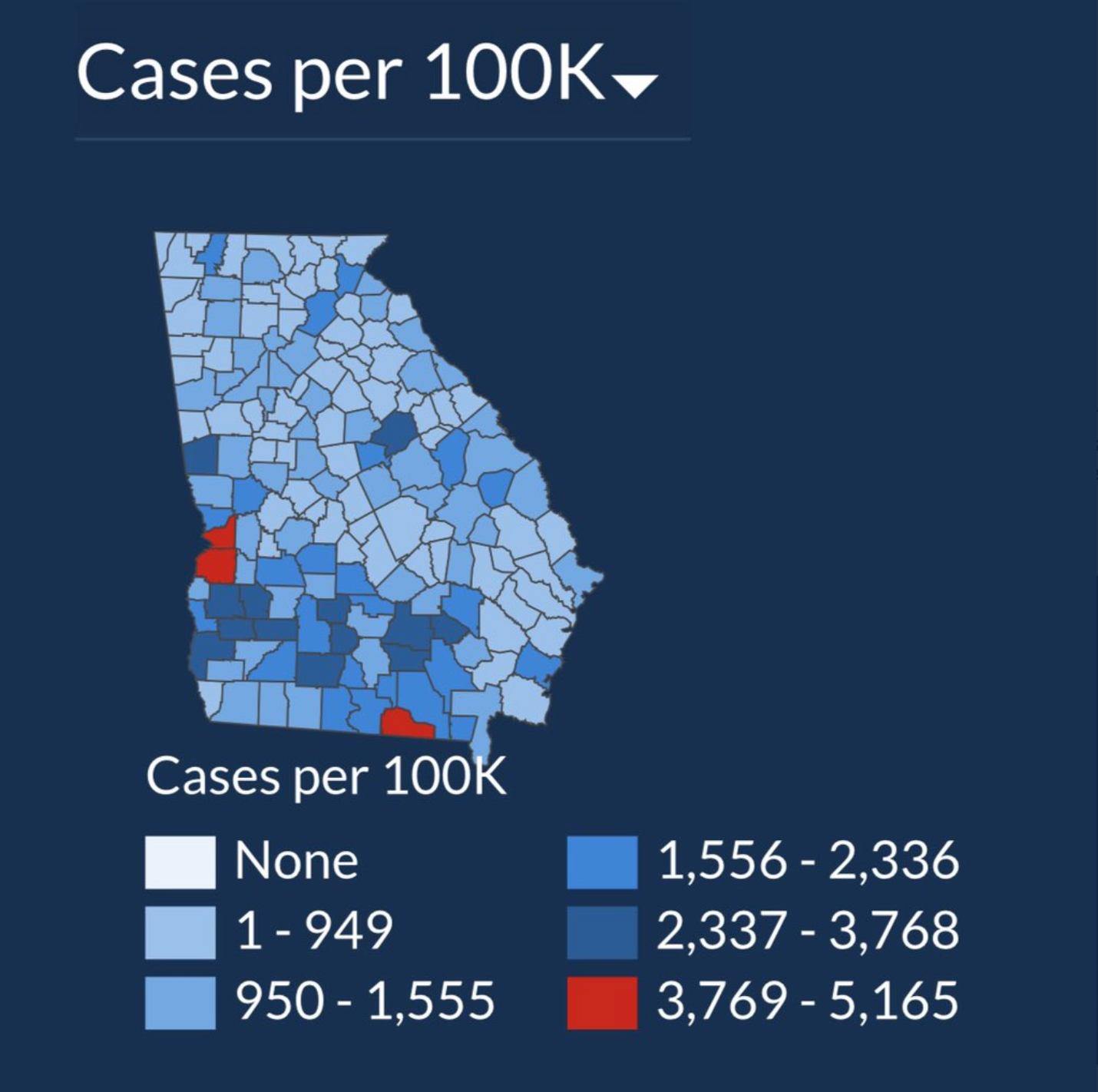
Image from July 17th, shared by Andisheh Nouraee, my screenshot of that image
You might think that these visualizations aren’t missing data at all—the values of the gradient bins are clearly labeled, and the map clearly shows how many cases exist for every 100K residents.
However, the missing data isn’t in the visualization itself, but in how it’s used. This heat map is provided to help people understand the relative case rate. If I were checking this graph every week or so, I would probably think that the case rate has stayed the same over that time period.
Instead, because the visualization uses auto-adjusting gradient bins, the red counties in the visualization from July 2nd cover a range from 2961 to 4661, while the same color counties on July 17th now have case rates of 3769–5165 cases per 100K residents. The relative size of the bins is different enough to where the bins can’t be compared with each other over time.
As reported by Keren Landman for the Atlanta Magazine, the Department of Public Health didn’t have direct control over the data on the dashboard anyway, making it harder to make updates or communicate the data more intentionally.
Thankfully, the site now uses a visualization with a consistent gradient scale, rather than auto-adjusting bins.
In this example, the combination of the visualization choice and the use of that visualization by the visitors of this website caused data to go missing and possibly resulting in biased decisions about whether it’s safe to go for a hike in the community.
How does data go missing? #
This example from the Georgia Department of Health describes one way that data can go missing, but there are many more.
Data can go missing from your visualization in a number of ways:
- If the data exists, but is not represented in the visualization, data is missing
- If data points and fluctuations are smoothed over, or connected across gaps, data is missing.
- If outliers and other values are excluded from the visualization, data is missing.
- If people can’t see or interact with the visualization, data is missing.
- If a limited number of results are being visualized, but the label and title of the visualization don’t make that clear, data is missing.
Accessible data visualizations prevent data from going missing #
Accessible visualizations are crucial for avoiding missing data because data can go missing if people can’t see or interact with it.
Lisa Charlotte Rost wrote an excellent series for Data Wrapper’s blog about colorblindness and data visualizations that I highly recommend for considering color vision accessibility for data visualization: How your colorblind and colorweak readers see your colors, What to consider when visualizing data for colorblind readers, and What’s it like to be colorblind.
You can also go further to consider how to make it easier for folks with low or no vision to interact with your data visualizations. Data visualization artist Mona Chalabi has been experimenting with ways to make her data visualization projects more accessible, including making a tactile version of a data visualization piece, and an interactive piece that uses touch and sound to communicate information, created in collaboration with sound artist Emmy the Great.
At a more basic level, consider how your visualizations look at high zoom levels and how they sound when read aloud by a screen reader. If a visualization is unintelligible at high zoom levels or if portions aren’t read aloud by a screen reader, those are cases where data has gone missing from your visualization. Any decisions that someone with low or no vision wants to make based on a data visualization is biased to include only the data visualizations that they can interact with successfully.
Beyond vision considerations, you want to consider cognitive processing accessibility to prevent missing data. If you overload a visualization with lots of overlays, rely on legends to communicate meaning in your data, or have a lot of text in your visualization, folks with ADHD or dyslexia might struggle to process your visualization.
Any data that people can’t understand in your visualization is missing data. For more, I recommend the blog post by Sarah L. Fossheim, An intro to designing accessible data visualizations.
Map with caution and label prodigiously: Beirut explosion map #
Data can go missing if you fail to visualize it clearly or correctly. When I found out about the explosion in Beirut, after I made sure that my friends and their family were safe, I wanted to better understand what had happened.

Image shared by Joanna Merson, my screenshot of the image
I haven’t had the privilege to visit Beirut before, so the maps of the explosion radius weren’t as easy for me to personally relate to. Thankfully, people started sharing maps about what the same explosion might look like if it occurred in New York City or London.
Image shared by Joanna Merson, my screenshot of the image
This map attempts to show the scale of the same explosion in New York City, but it’s missing a lot of data. I’m not an expert in map visualizations, but thankfully cartographer Joanna Merson tweeted a correction to this map and unpacked just how much data is missing from this visualization.
There’s no labels on this map, so you don’t know the scale of the circles, or what distance each blast radius is supposed to represent. You don’t know what the epicenter of the blast is because it isn’t labeled, and perhaps most egregiously, the map projection used is incorrect.
Joanna Merson created an alternate visualization, with all the missing data added back in.

Image by Joanna Merson, my screenshot of the image.
Her visualization carefully labels the epicenter of the blast, as well as the radii of each of the circles that represent different effects from the blast. She’s also careful to share the map projection that she used—one that has the same distance for every point along that circle. It turns out that the projection used by Google Maps is not the right projection to show distance with an overlaid circle. Without the scale or an accurate projection in use, data goes missing (and gets added) as unaffected areas are misleadingly shown as affected by the blast.
How many of you are guilty of making a geospatial visualization, but don’t know anything about map projections and how they might affect your visualization?
Joanna Merson further points out in her thread on Twitter that maps like this with an overlaid radius to show distance can be inaccurate because they don’t take into account the effect of topography. Data goes missing because topography isn’t represented or considered by the visualization overlaid on the map.
It’s impractical to model everything perfectly in every map visualization. Depending on how you’re using the map, this missing data might not actually matter. If you communicate what your visualization is intended to represent when you share it, you can convey the missing data and also assert its irrelevance to your point. All maps, after all, must make decisions about what data to include based on the usage of the map. Your map-based data visualizations are no different!
It can be easy to cut corners and make a simple visualization to communicate the results of data analysis quickly. It can be tedious to add a scale, a legend, and labels to your visualization. But you must consider how your visualization might be used after you make it—and how it might be misused.
Will a visualization that you create end up in a blog post like this one, or a Twitter thread unpacking your mistakes?
What can you do about missing data? #
To prevent or mitigate missing data in a data visualization, you have several options. Nathan Yau of Flowing Data has a very complete guide for Visualizing Incomplete and Missing Data that I highly recommend in addition to the points that I’m sharing here.
Visualize what’s missing #
One important way to mitigate missing data in a data visualization is to devise a way to show the data that is there alongside the data that isn’t. Make the gaps apparent and visualize missing data, such as by avoiding connecting the dots between missing values in a line chart.
In cases where your data has gaps, you can add annotations or labels to acknowledge and explain any inconsistencies or perceived gaps in the data. In some cases, data can appear to be missing, but is actually a gap in the data due to seasonal fluctuations or other reasons. It’s important to thoroughly understand your data to identify the difference.
If you visualize the gaps in your data, you have the opportunity to discuss what can be causing the gaps. Gaps in data can reflect reality, or flaws in your analysis process. Either way, visualizing the gaps in your data is just as valuable as visualizing the data that you do have. Don’t hide or ignore missing data.
Carefully consider time spans #
Be intentional about the span that you choose for time-based visualizations. You can unintentionally hide fluctuations in the data if you choose an overly-broad span for your visualization, causing data to go missing by flattening it.
If you choose an overly-short time span for your visualization, however, the meaning of the data and what you’re trying to communicate can go missing with all the noise of the individual data points. Consider what you’re trying to communicate with the data visualization, and choose a time span accordingly.
Write clearly #
Another way to address missing data is to write good labels and titles for visualizations. It’s crucial to explain exactly what is present in a visualization—an important component of communicating results. If you’re intentional and precise about your labels and titles, you can prevent data from going missing.
If the data analysis contains the results for the top 10 cities by population density, but your title only says “Top Cities”, data has gone missing from your visualization!
You can test out the usefulness of your labels and titles by considering the following: If someone screenshots your visualization and puts it in a different presentation, or tweets it without the additional context that might be in the full report, how much data would be missing from the visualization? How completely does the visualization communicate the results of data analysis if it’s viewed out of context?
Validate your scale #
Make sure any visualization that you create has a scale and that it’s included. It’s really easy for data to go missing if the scale of the data itself is missing.
Also validate that the scale on your visualization is accurate and relevant. If you’re visualizing percentages, make sure the scale goes from 0-100. If you’re visualizing logarithmic data, make sure your scale reflects that correctly.
Consider the use #
Consider how your visualization will be used, and design your visualizations accordingly. What decisions are people trying to make based on your visualization? What questions are you trying to answer when you make it?
Automatically-adjusting gradient bins in a heat map can be an excellent design choice, but as we saw in Georgia, they don’t make sense to communicate relative change over time.
Choose the right chart for the data #
It’s also important to choose the right chart to visualize your data. I’m not a visualization expert, so check out this data tutorial from Chartio, How to Choose the Right Data Visualization as well as these tutorials of different chart types on Flowing Data: Chart Types.
I do want to recommend that if you’re visualizing multiple aggregations in one visualization in the Splunk platform, consider the Trellis layout to create different charts to help compare across the aggregates.
Always try various types of visualizations for your data to determine which one shows the results of your analysis in the clearest way.
One of the best ways to make sure your data visualization isn’t missing data is to make sure that the data analysis is sound.
The next post in this series addresses how data can go missing while you analyze it: Analyze the data: How missing data biases data-driven decisions.