Communicate the data: How missing data biases data-driven decisions
This is the third post in a series about how missing data biases data-driven decisions. Start at the beginning: What’s missing? Reduce bias by addressing data gaps in your analysis process.
Communicating the results of a data analysis process is crucial to making a data-driven decision. You might review results communicated to you in many ways:
- A slide deck presented to you
- An automatically-generated report emailed to you regularly
- A white paper produced by an expert analysis firm that you review
- A dashboard full of curated visualizations
- A marketing campaign
If you’re a data communicator, what you choose to communicate (and how you do so) can cause data to go missing and possibly bias data-driven decisions made as a result. In this post, I’ll cover the following:
- A marketing campaign that misrepresents the results of a data analysis process
- A renowned white paper produced by leaders in the security space
- How data goes missing at the communication stage
- What you can do about missing data at the communication stage
Spotify Wrapped: Your “year” in music #
If you listen to music on Spotify, you might have joined in the hordes of people that viewed and shared their Spotify Wrapped playlists and images like these last year.
Spotify Wrapped is a marketing campaign that purports to communicate your year in music, based on the results of some behind-the-scenes data analysis that Spotify performs. While it is a marketing campaign, it’s still a way that data analysis results are being communicated to others, and thus relevant to this discussion of missing data in communications.
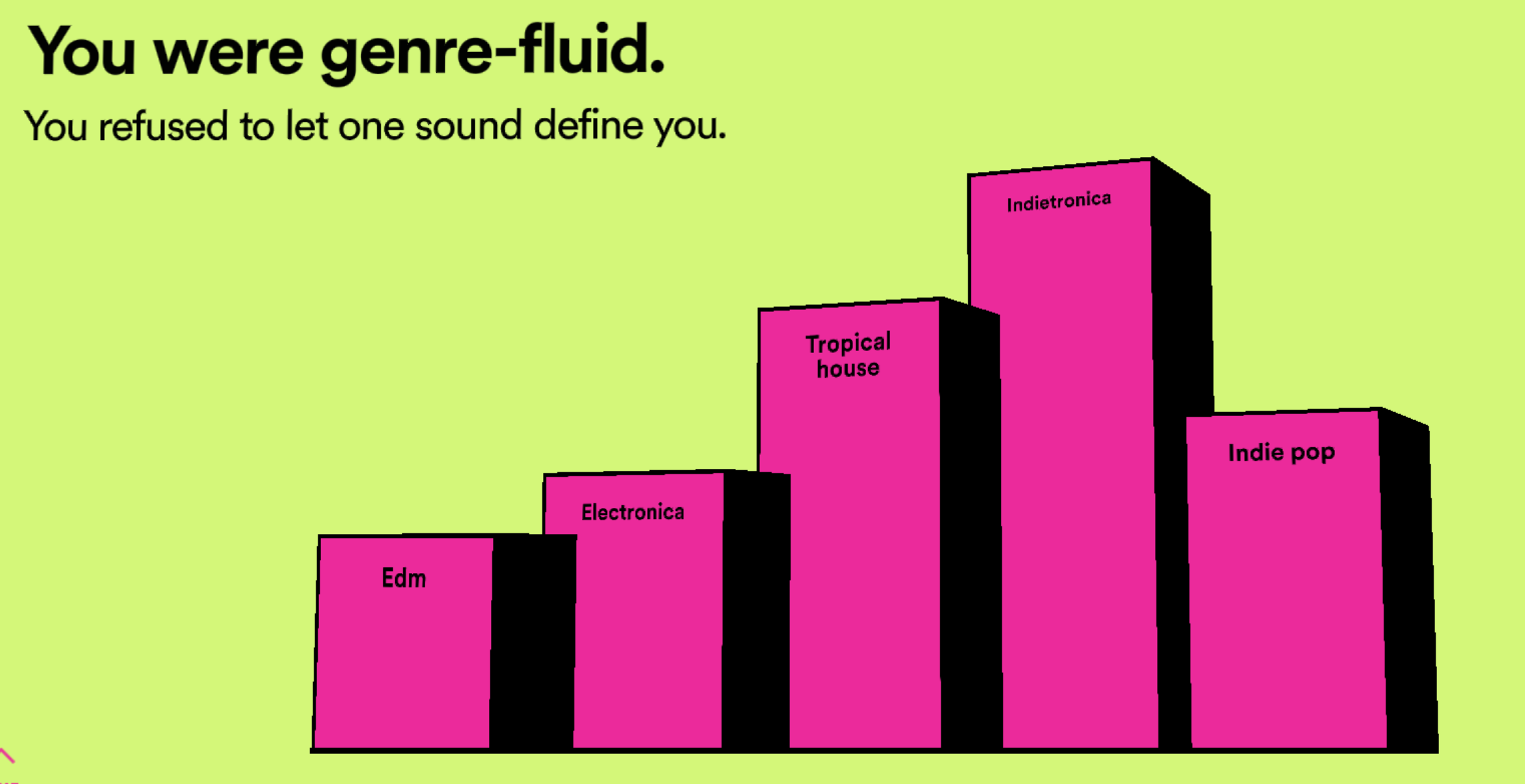

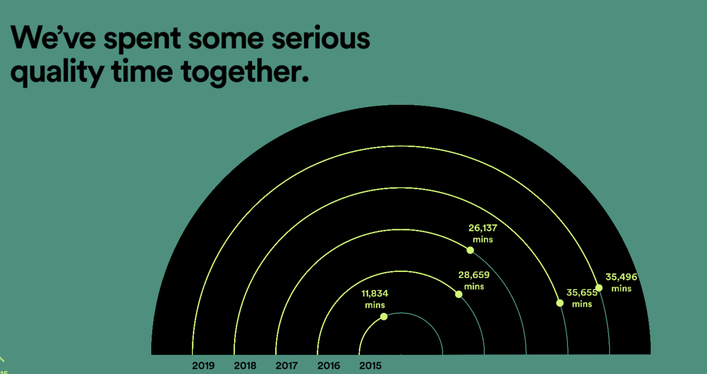
In this case you can see that my top artists, top songs, minutes listened, and top genre are shared with me, along with the number of artists that I discovered, and even the number of minutes that I spent listening to music over the last year. It’s impressive, and exciting to see my year in music summed up in such a way!
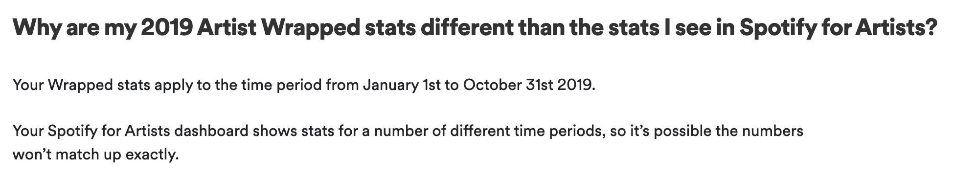
But after I dug deeper into the data, the gaps in the communication and data analysis became apparent. What’s presented as my year in music is actually more like my “10 months in music”, because the data only represents the period from January 1st to October 31st of 2019. Two full months of music listening behavior are completely missing from my “year” in music.
Unfortunately, these details about the dataset are missing from the Spotify Wrapped campaign report itself, so I had to search through additional resources to find out more information. According to a now-archived FAQ on Spotify for Artists (thank goodness for the Wayback Machine), the data represented in the campaign covers the dates from January 1st, 2019 – October 31st, 2019. I also read two key blog posts, Spotify Wrapped 2019 Reveals Your Streaming Trends, from 2010 to Now announcing the campaign and Unwrapping Wrapped 2019: Spotify VP of Engineering Tyson Singer Explains digging into the data analysis behind the campaign, to learn what I could about the size of the dataset, or how many data points might be necessary to draw the conclusions shared in the report.

This is a case where data is going missing from the communication because the data is presented as though it represents an entire time period, when in fact it only represents a subset of the relevant time period. Not only that, but it’s unclear what other data points actually represent. The number of minutes spent listening to music in those 10 months could be calculated by adding up the actual amount of time I spent listening to songs on the service, but could also be an approximate metric calculated from the number of streams of tracks in the service. It’s not possible to find out how this metric is being calculated. If it is an approximate metric based on the number of streams, that’s also a case of uncommunicated missing data (or a misleading metric), because according to the Spotify for Artists FAQ, Spotify counts a song as streamed if you’ve listened to at least 30 seconds of a track.
It’s likely that other data is missing in this incomplete communication, but another data communication is a great example of how to do it right.
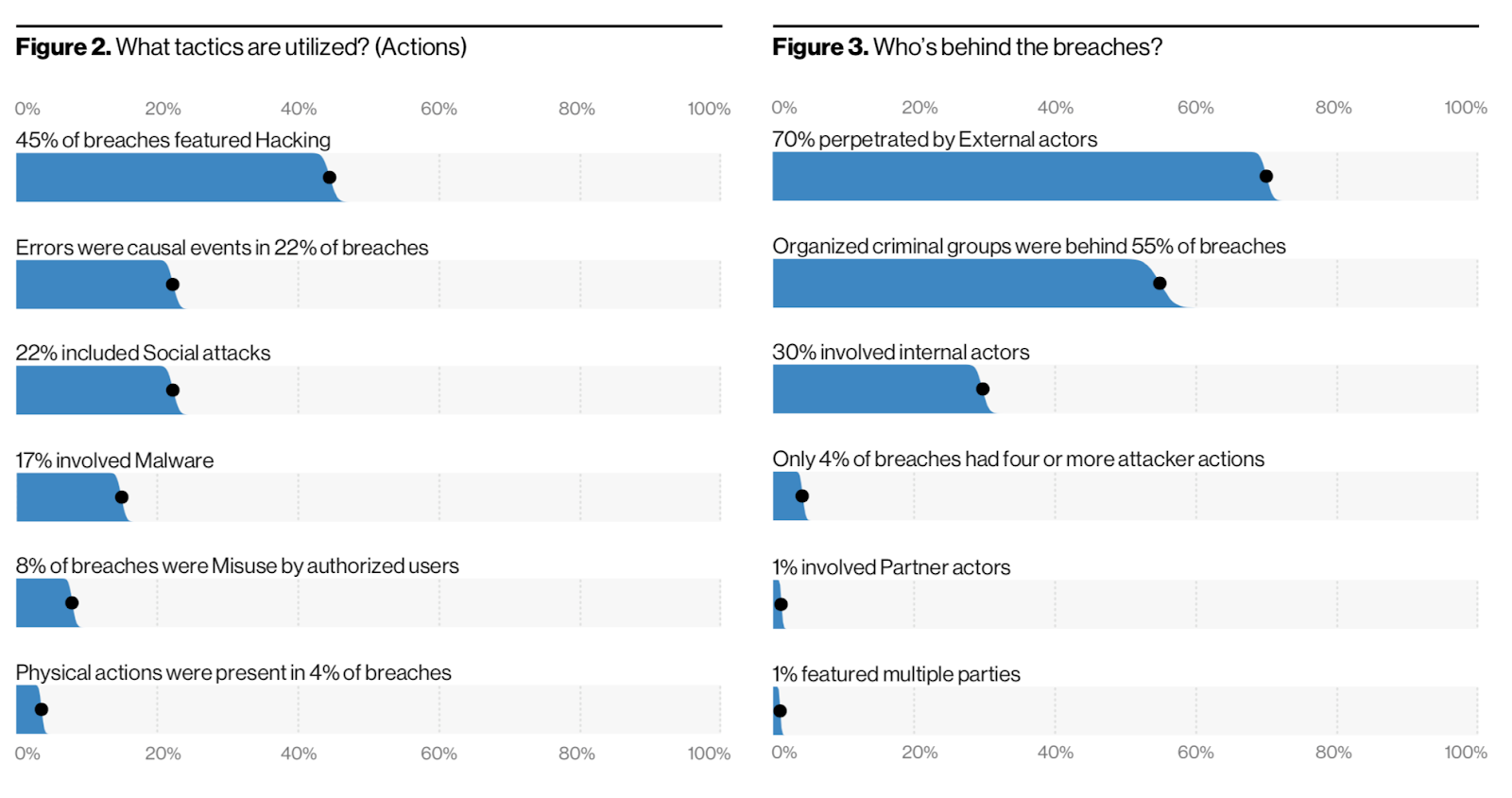
Verizon DBIR: A star of data communication #
The Verizon Data Breach Investigations Report (DBIR) is an annual report put out by Verizon about, well, data breach investigations. Before the report shares any results, it includes a readable summary about the dataset used, how the analysis is performed, as well as what is missing from the data. Only after the limitations of the dataset and the resulting analysis is communicated, are the actual results of the analysis shared.
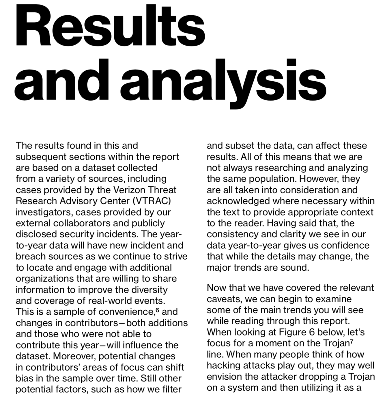
And those results are well-presented, featuring confidence intervals, detailed titles and labels, as well as clear scales to visualize the data. I talk more about how to prevent data from going missing in visualizations in the next post of the series, Visualize the data: How missing data biases data-driven decisions.
How does data go missing? #
These examples make it clear that data can easily go missing when you’re choosing how to communicate the results of data analysis.
- You include only some visualizations in the report — the prettiest ones, or the ones with “enough” data
- You include different visualizations and metrics than the ones in the last report, without an explanation about why they changed, or what changed. For example, what happened in Spain in late May, 2020 as reported by the Financial Times: Flawed data casts cloud over Spain’s lockdown strategy.
- You choose not to share or discuss the confidence intervals for your findings.
- You neglect to include details about the dataset, such as the size of the dataset or the representativeness of the dataset.
- You discuss the available data as though it represents the entire problem, rather than a subset of the problem.
For example, the Spotify Wrapped campaign shares the data that it makes available as though it represents an entire year, but instead only reflects 10 months, and doesn’t include any details about the dataset beyond what you can assume—it’s based on Spotify’s data. This missing data doesn’t make the conclusions drawn in the campaign inaccurate, but it is additional context that can affect how you interpret the findings and make decisions based on the data, such as which artist’s album you might buy yourself to celebrate the new year.
What can you do about missing data? #
To mitigate missing data in your communications, it’s vital to be precise and consistent. Communicate exactly what is and is not covered in your report. If it makes sense, you could even share the different levels of disaggregation used throughout the data analysis process that led to the results discussed in the final communication.
Consistency in the visualizations that you choose to include, as well as the data spans covered in your report, can make it easier to identify when something has changed since the last report. Changes can be due to missing data, but can also be due to something else that might not be identified if the visualizations in the report can’t be compared with each other. If you do change the format of the report, consider continuing to provide the old format alongside the new format. Alternately, highlight what is different from the last report, why you made changes, and clearly discuss whether comparisons can or cannot be made with older formats of the report to avoid unintentional errors.
If you know data is missing, you can discuss it in the report, share why or why not the missing data matters, and possibly choose to communicate a timeline or a business case for addressing the missing data. For example, there might be a valid business reason why data is missing, or why some visualizations have changed from the previous report. The 2020 edition of Spotify Wrapped will almost certainly include different types of data points due to the effects of the global pandemic on people’s listening habits. Adding context to why data is missing, or why the report has changed, can add confidence in the face of missing data—people now understand why data is missing or has changed.
Often when you’re communicating data, you’re including detailed visualizations of the results of data analysis processes.
The next post in this series covers how data can go missing from visualizations, and what to do about it: Visualize the data: How missing data biases data-driven decisions.